Episode 5: Convey the images to the world by “Design System”
2017-07-28
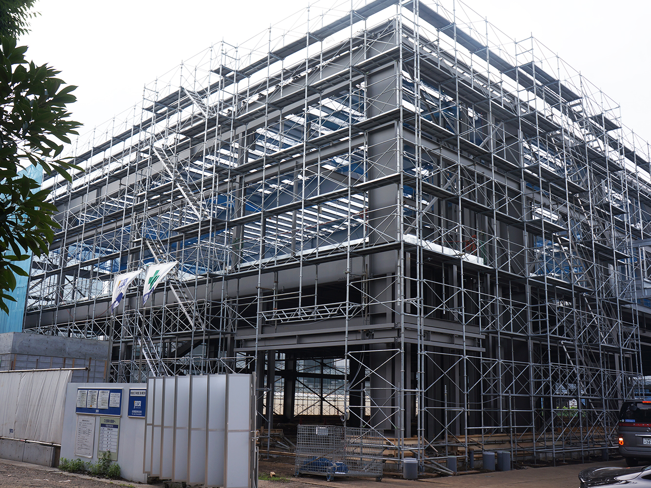
Finally, a skeleton structure of the factory has been completed without any troubles after spending one month to build steel frames.
It is known that building frames are the most difficult tasks in the building construction and largely affected by the weather conditions. Mr. Yu-nosuke Ito, Site supervisor (Yatsu Construction Co.,Ltd., First-class registered architect) told us as follows.
“I am really released by breaking the heart of the construction. After this, we start working for cement work of the floors, exterior walls, and then, interior works. I am lucky with great staff and weather. It’s progressing smoothly, which I have rarely experienced in recent years. In my estimate, we could have finished the construction by the end of this October unless we experienced huge typhoon. “
We asked if he expericed any troubles although he said it was progressing smoothly. His answer was “Winds from Tanzawa mountains.”
Strong winds cause clouds of sand dust at the working site, and they are troublesome for field workers. We understand that such his clued-up attention to his staff makes smooth progress of the construction works.
There have been no accident recorded from the start of the construction. We hope to continue the construction with safety-first.
In the beginning of this month, professionals gathered at a construction office in the construction field to discuss about exterior and interior works.
In the meeting, they mostly discussed about company logo in the exterior of the new factory. According to a regulation of Kanagawa Pref., any signboard placed in 10 meter high or higher must be its size of 10 square meters or smaller. With such consideration in mind, the project takes place deliberately.
In the exterior, a logo of “MIZUKI” will be placed. In the meeting, I am impressed to share how the logo designed, and what kind of wishes contained in it.
Who are the targets of the symbol mark?
Mr. Mizuki, the president, started the meeting as follows
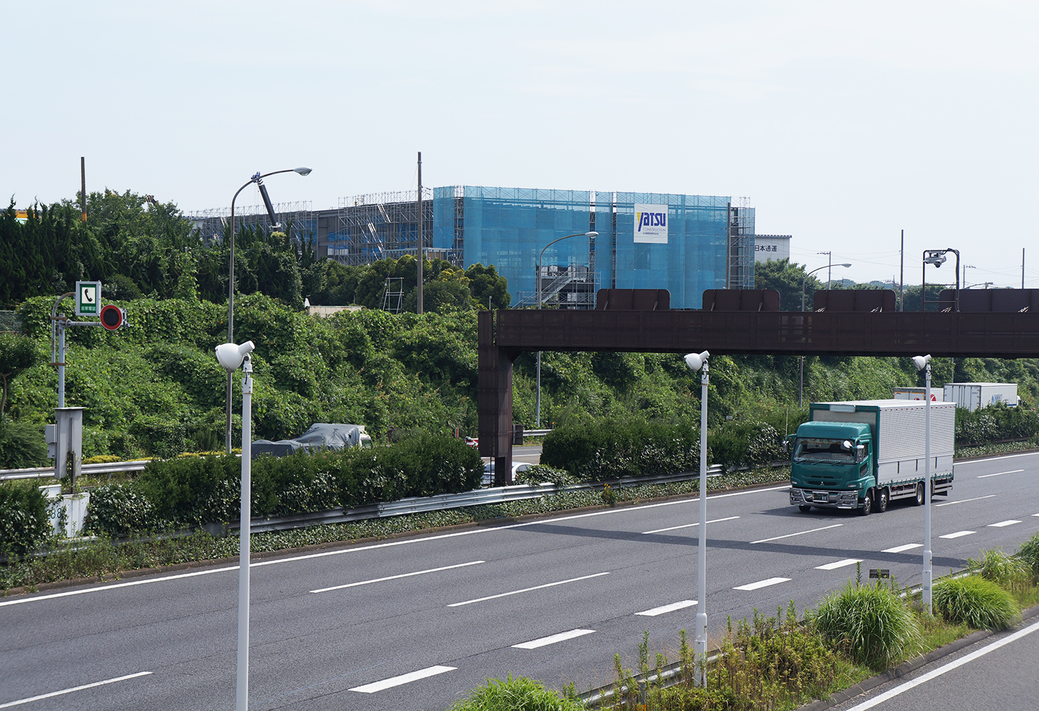
“I planned to place the company logo just above the entrance, completely opposite side of the highway. However, the factory faces to the highway. Whenever I go through in front of the factory by car, I realize the factory is located in the best place. It makes me feel that our targets are all the people in Japan and the world who drive through in front of our factory as well as those who pass through the factory entrance. I hold Today’s meeting to consult you, professionals, about an installation position of the company logo with consideration for our goals, looking into the world.”
The participants is total five people, Mr. Taichi Mizuki (President), Mr. Akihiko Sano (Brand designer, President of sole color design Co., Ltd.), Mr. Koichi Mukoyama (Architect, Idumi Sekkei Co., Ltd.), Mr. Yu-nosuke Ito (Construction field supervisor), and Mr. Takeshi Idei (Signboard constructor, Gloria Arts Co.)
Mr. Sano, who manages branding and design of Mizuki, explains as follows to share his intensions with participants.
“The purpose of the sign of the factory is an embodiment of Mizuki’s branding concept, “World-class parts maker from Japan.” So that, the sign plan, including installation of the company logo, should not just dress up. I would like to send proper messages from Mizuki to their customers, subcontractors, those who working together, and communities with twist.”
“Eye-catching signboard is the best.”
I had thought so in mind. It makes me change my thoughts by joining the meeting and discussing issues from various perspectives. I am getting to understand the meaning and the aim of the symbol mark by learning the importance of “Who is a target of a symbol mark?”, and by discussing “What is the best way to show the sign?”
Convey the images to the world with “Design system”
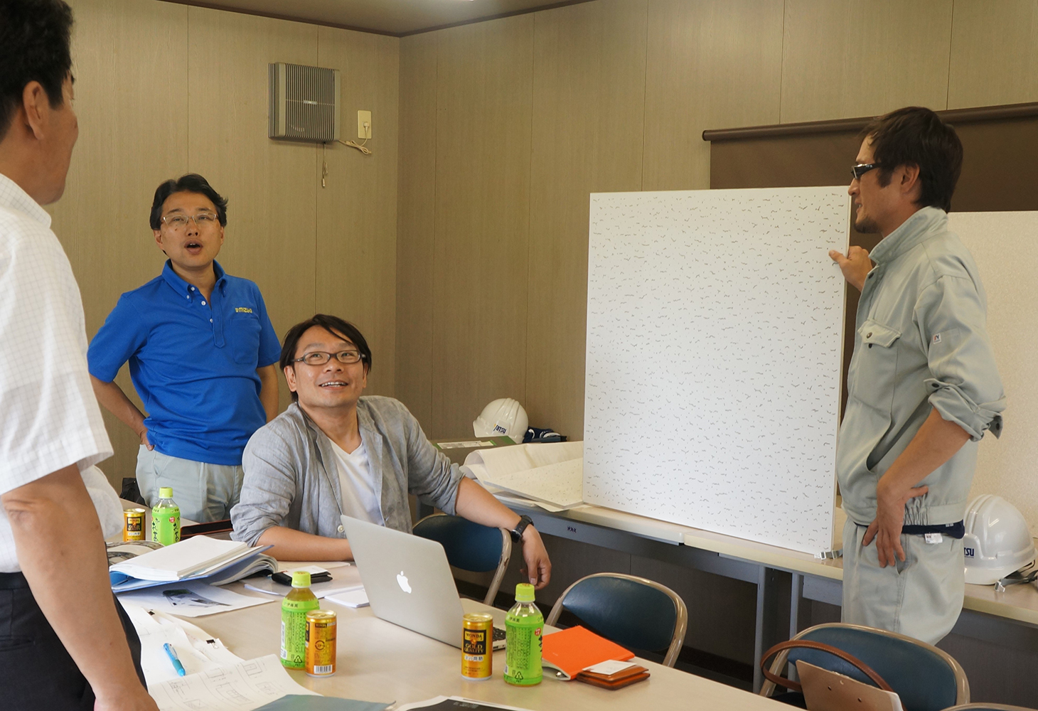
Following Mr. Sano’s comment, layout and design professionals discussed about effective distributions of symbols with consideration of local regulations.
Mr. Ito said “This is the maximum letter size of company name we can place on the exterior according to the wall size”, and he brought a square panel to the conference room.
“The panel is huge in front of us, but how do we feel it when we see the panel from cars in Tomei highway.” We continued the discussion including readability.
Other than the size, they also discussed about the details such as the best positions of the sign when visitors come from the station, and the balance with local views.
The factory symbol of MIZUKI was designed in 2014 by Mr. Sano. He provided some documents to project members about its brand design. With his permission, we introduce some of materials for the brand design.
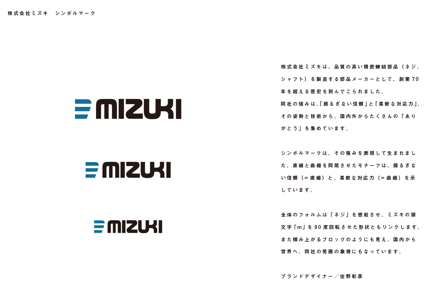
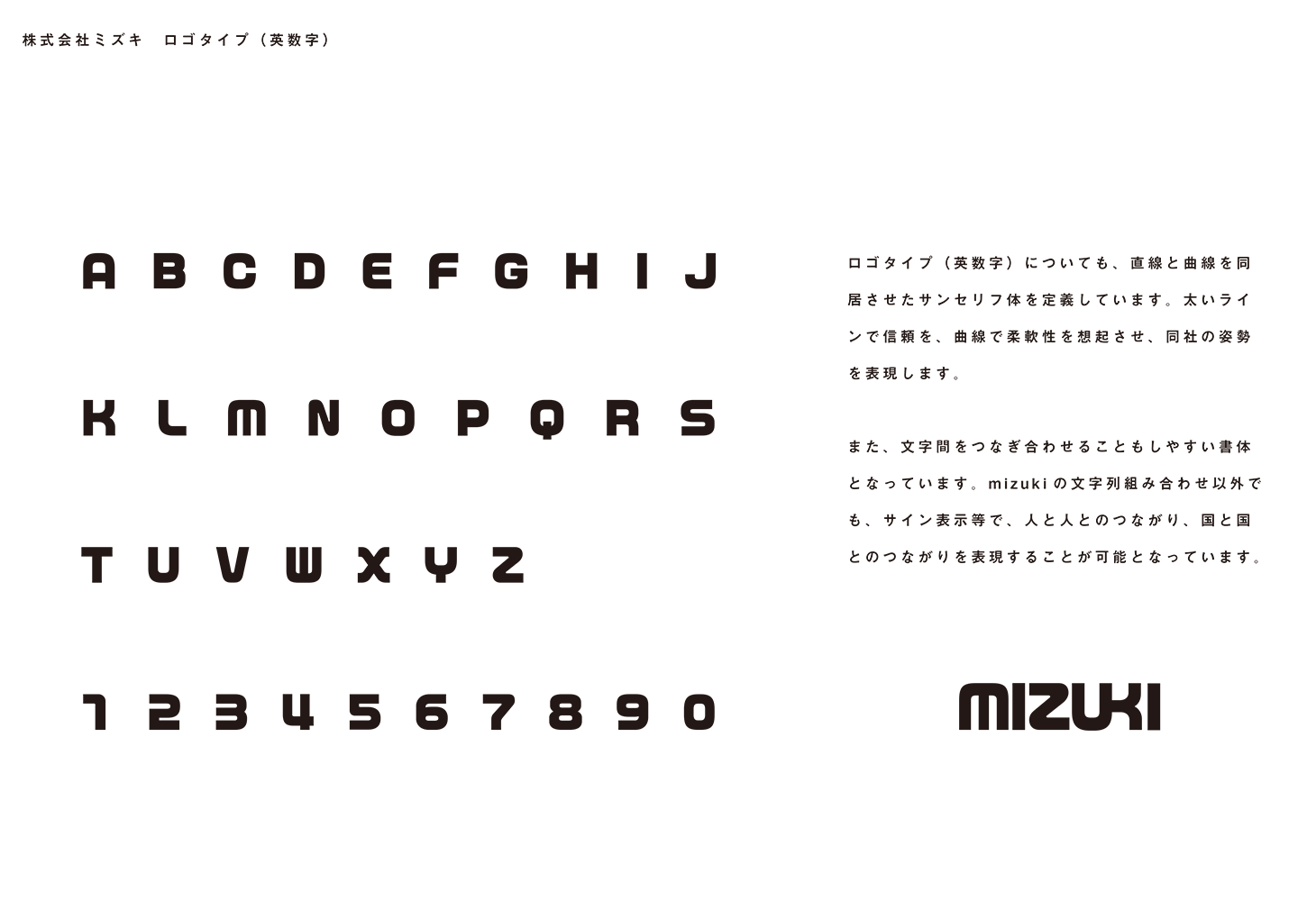
“Thought is most important in the branding. We clear up why it exits and what we aim, and visualize them by designing. It is the branding design. Design make one to visualize by colors and shapes. However the design without Thought is formality, and cannot be a brand. Mizuki’s thought is “Gather Thank-you domestically and internationally.” The goal is to be “World-class parts maker from Japan.”
They need “Connections” to make it happens. Mizuki’s logo discribes human-to-human and nation-to-nation connections. It also implement the idea of Design System, and defines alphabets from A to Z in bold font. I expect to use the font for flat printing materials to 3D works such as the sign as well as the company logo. The design can be standardized.
With consideration of Design System, they confirmed how to proceed all factory signs such as “Washroom”, “Elevator”, and “Do not Enter” as well as exterior company logo in the meeting.
Aim to gather Thank-you from the world
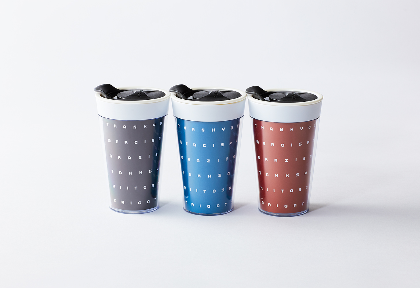
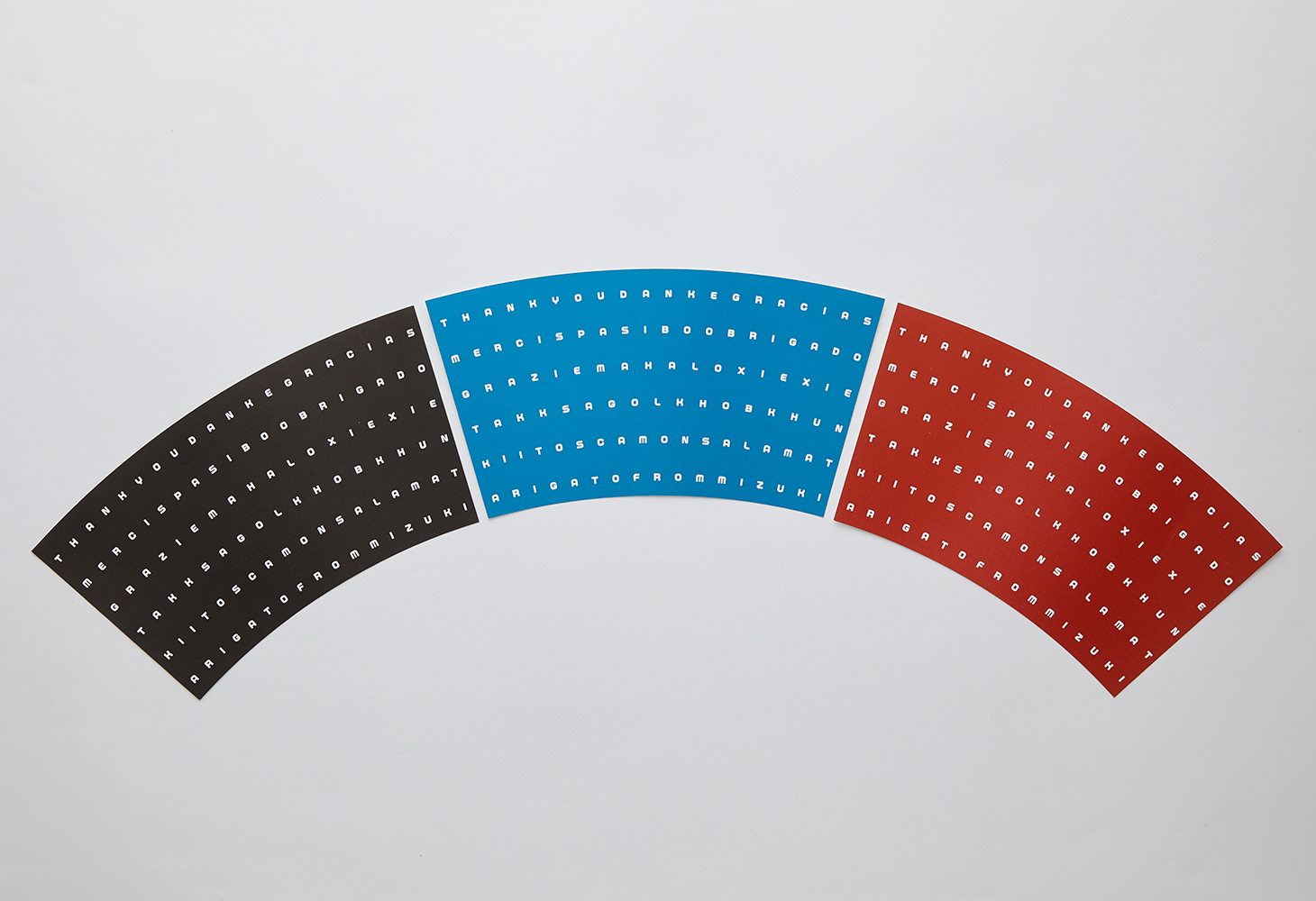
This is original designed coffee tumbler. Mr. Sano designed it, too. In the label, the font above are used. When checking into the details, you will see “Thank you”, “DANKE”, and “Gracias.” Those are the word of appreciation in many languages. Finally, it concludes the final line with “ARIGATO FROM MIZUKI.” It is the design we hope to be, “Gather Thank you from the world.”
Using “Design System” to deliver “Thank you” to the world. Knowing such a case, we exist to know more about the sign plan. Also, we hope to be one who can deliver the thought in the symbol.

